Why Does the RobotBooker Room Booking System Use the Overview Chart and not Outlook-Style Calendars?
The RobotBooker Room Booking/Resource Booking System uses a custom-built Overview Chart as a recommended base for making bookings. Why not use the more common Outlook-style Calendar?
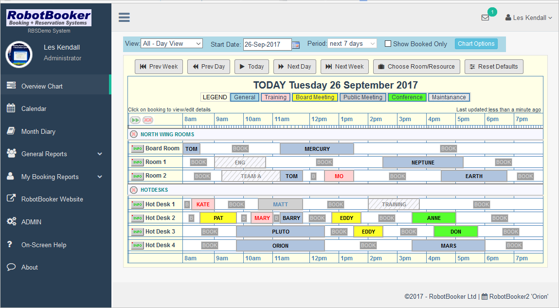
The RobotBooker Room Booking/Resource Booking System (meeting room and resource reservation software) uses a custom-built Overview Chart as a recommended base for making bookings. Why not use the more common Outlook-style Calendar?
It’s all to do with how much data you are trying to visualise. It’s easier to explain with an example. Let’s see what the RobotBooker Overview Chart looks like:
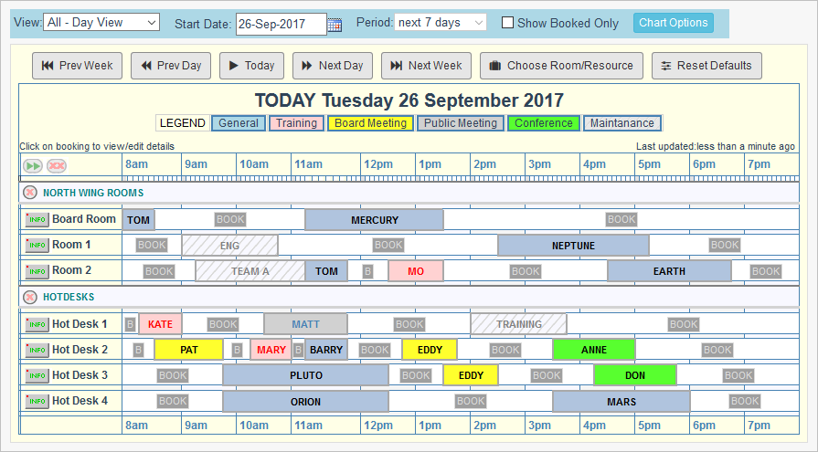
So we have Rooms/Resources down the left side, and the time of the day across the top. This particular chart is showing 7 resources and there are 20 bookings on this day. If you wanted to book a room or a desk then you can see instantly not only what is available but also what times and durations are available.
Outlook-style calendars (‘calendars’) are much more popular. By ‘Outlook-style’, I mean Microsoft Outlook, one of the greatest software products ever made. Most other companies copied that style, so why doesn’t RobotBooker do the same?
Calendars were designed with a single person in mind. Most people do tasks one at a time, so scheduled events are usually a series of timed tasks in chronological order, one after the other. That’s great and has its uses for individuals, but in a booking system you have many events occurring simultaneously. A Booking system is also dynamic where many people many be concurrently competing to reserve a finite number of resources.
If you look at the same data that is on the RobotBooker Overview Chart in a calendar, you get a more confusing picture:
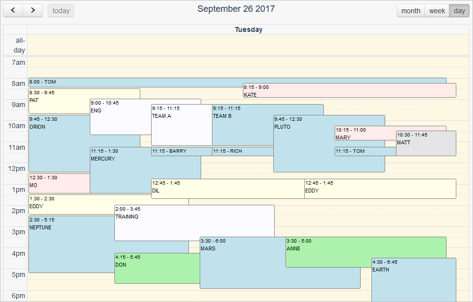
All the data is there but it’s difficult to see what resources are available and how long for.
The calendar Week View is useless and already overloaded even with this small number of resources and bookings.:
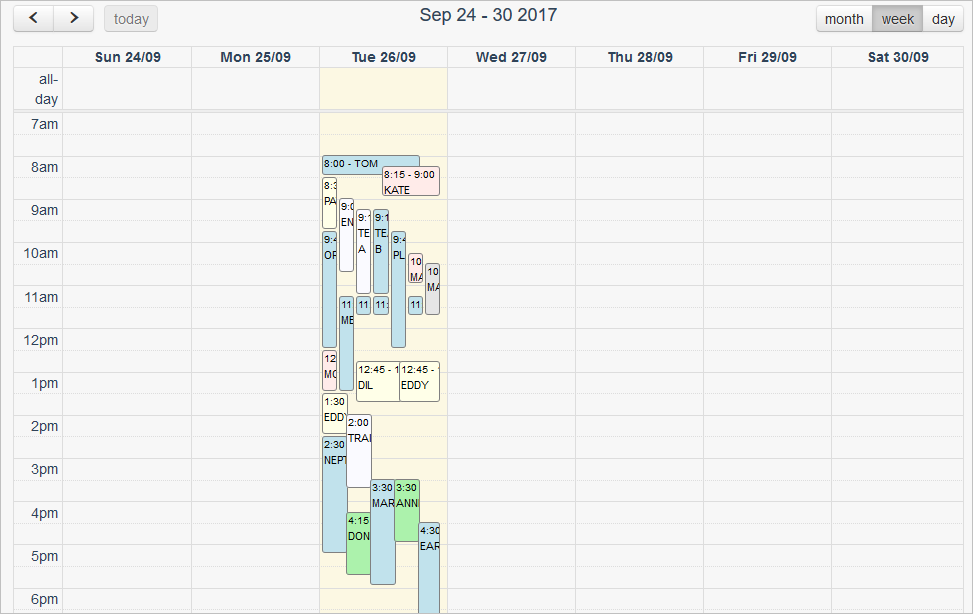
The Month View is OK if you just want to know what time events will start, but does not indicate durations or really highlight where gaps may be available:
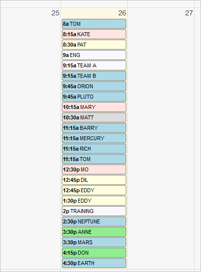
So the RobotBooker Overview Chart is probably the most practical way view busy resource/meeting rooms bookings.
Read more about the RobotBooker Booking System at RobotBooker.com. It is a low-cost, easy to use, web-based system. You don’t need any technical knowledge to set it up or maintain it. Ask for a 30-day free trial.
